Hello
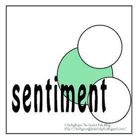
The week has rushed by and I've not had a minute to update my blog. So this is a bit of late catch up for my first project with the new October LO from The Sketch File.
I quite like the idea of making the word element the main feature. Often the sentiment is a bit of an after-thought, but this month I have to think about that bit first.
When I was going through my box of Christmas stash and leftovers I came across a few of these quotation panels I made but didn't use all of last year. Perfect for the new sketch!
Here's the sketch
 |
| The Sketch File.October 2017 |
I liked how it turned out, so I made another one in red and white this time
This is the sort of card I tend to make at Christmas when I have a lot to do. I try to keep the design simple and dare I say, stylish.
I think I'll make more like this - maybe use a different Christmassy quotation, and I could switch the snowflakes for my other favourite element; stars!
Anyway, that's it, two very simple cards ready to go in the Cword card box! I hope you like them.
Thanks for looking, please let me know what you think....


These are fabulous Kathy!
ReplyDeleteHugs
Linda xxx
Hi Kathy both of your cards are stunning I love them both. Take care. Hugs Jackie
ReplyDeletethese are both beautiful Kathy
ReplyDeletegr karin
Beautiful and so very elegant Kathy!
ReplyDeleteLaine
xx
Two lovely cards Kathy and a very stylish design. I think I prefer the second one, it's a more elegant colourway xx
ReplyDeleteBeautifully designed cards Kathy - work equally as well in both the colour ways. Shabneez
ReplyDeleteTwo stunning cards Kathy, I love the snowflakes. It's a great idea to use the sentiment as the main focus. Cathy x
ReplyDelete